How did it start
How did it start
How did it start
Balancing the demands of a busy career and an active social life, young professionals often struggle with the complexities of daily commutes. They need a product that can efficiently plan and navigate options between ride shares and public transportation, ensuring seamless transitions from home to work to events safely.
Overview
Overview
Overview
Point B is a mobile commuter app designed to streamline the daily travel routines of young professionals. By seamlessly integrating various transportation options, including ride shares and public transportation, Point B offers users a solution for efficient and stress-free commuting. The app prioritizes safety and cost-effectiveness, providing real-time updates and optimal route planning to ensure that users can navigate their journeys with confidence and ease
Initial Research
Initial Research
At the discovery phase of the project, I conducted five user interviews along with my team mates in order to get a better understanding what really mattered to users.
At the discovery phase of the project, I conducted five user interviews along with my team mates in order to get a better understanding what really mattered to users.
Pain Points
Pain Points
Key paint points I found during user interviews were:
Cost Concerns: Expenses associated with commuting, such as fuel, parking fees, or ride-sharing fares, can strain tight budgets, especially for entry-level professionals. So they want something that promotes coupons or promotions.
Traffic Congestion: Delays caused by traffic jams or public transit disruptions lead to frustration and wasted time.
Safety Issues: Concerns about personal safety while using ride-sharing services or waiting at public transit stops can cause anxiety, particularly when traveling late at night.
Limited Options: Depending on location or time of day, commuters may have limited transportation options available, leading inibilty to properly plan out their routes.
Information Overload: Sorting through various transportation options, schedules, and fares can be overwhelming, making it difficult to make informed decisions about the best route.
Competitive
Analysis
Competitive
Analysis
Addressing the areas, Point B can effectively differentiate itself from existing competitors and become the go-to app
Addressing the areas, Point B can effectively differentiate itself from existing competitors and become the go-to app
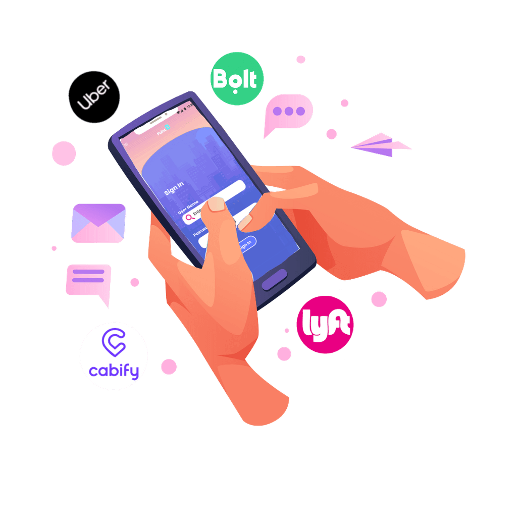
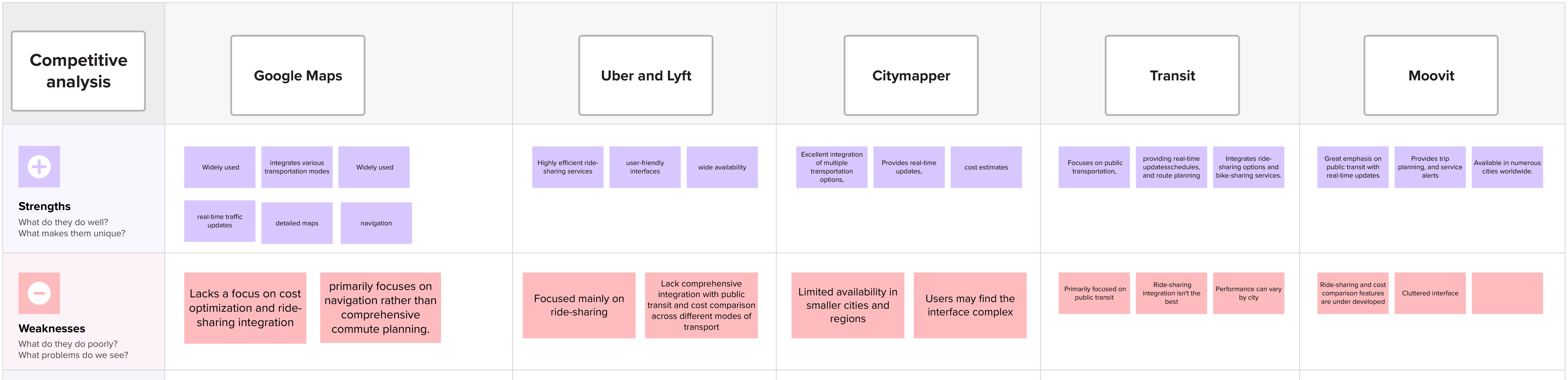
Point B stands out in the commuter app market by addressing the specific needs of young professionals. Unlike competitors like Google Maps, Citymapper, Transit, Moovit, Uber, and Lyft, Point B offers:
Seamless Integration: Combines ride shares and public transit in one app.
Cost Savings: Helps users find the cheapest travel options.
Safety: Includes safety features like driver ratings and ride tracking.
User-Friendly Design: Easy to use, making commute planning simple.
User Personas
Emily:
User Persona Emily:

Safety Conscious Night Owl Age: 29
Event Coordinator Toronto ON
Frequently uses ride shares and public transit, especially during late hours.
Concerned about safety when finding reliable transportation at night.
Prioritizes safety and reliability in her commuting choices, especially after evening events.
User Personas
Sarah:
User Persona Sarah:

Young Professional Age: 27
Marketing Manager
Central London
Uses a mix of public transit and ride shares to get to work and attend social events.
Struggles with time management due to unpredictable transit schedules and high ride-share costs.
Seeks a reliable, cost-effective, and efficient commuting solution that can adapt to her dynamic schedule.
Ideation
Ideation
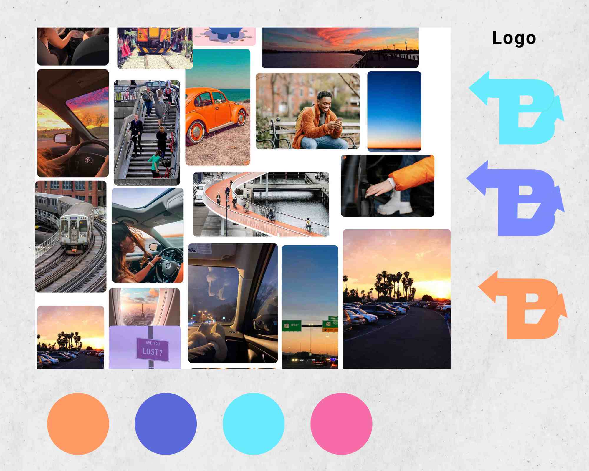
In the ideation phase for Point B, I created a mood board to gather inspiration for making the app bright, colourful, and youthful. Since the app is designed for busy young professionals, I aimed to use popular, trending colours like medium slate blue, aqua, and deep pink to create a vibrant interface.
For the text, I chose Poppins, a simple and easy-to-read font that contributes to a clean, modern look. My goal was to design a user-friendly interface that was free of clutter, making it easy for users to navigate.
For the logo, I combined the arrows found on traffic signs with the letter 'B'. This design represents the app's function of guiding users to their desired destinations while remaining unique and easily recognizable.
Initial designs
Initial designs
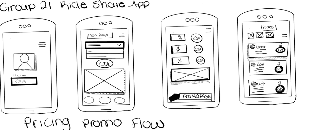
The initial designs and sketches for Point B focused primarily on price promotion. However, after user testing, I realized that while price promotion was important, users needed more from the app. It became clear that user safety and multiple transportation options were crucial aspects that needed more attention.
To address these needs, I ensured that the final iterations of the app allowed users to easily navigate and connect to various transportation options. This enhancement made the app more comprehensive and user-friendly, meeting the broader needs of our users beyond just price promotion
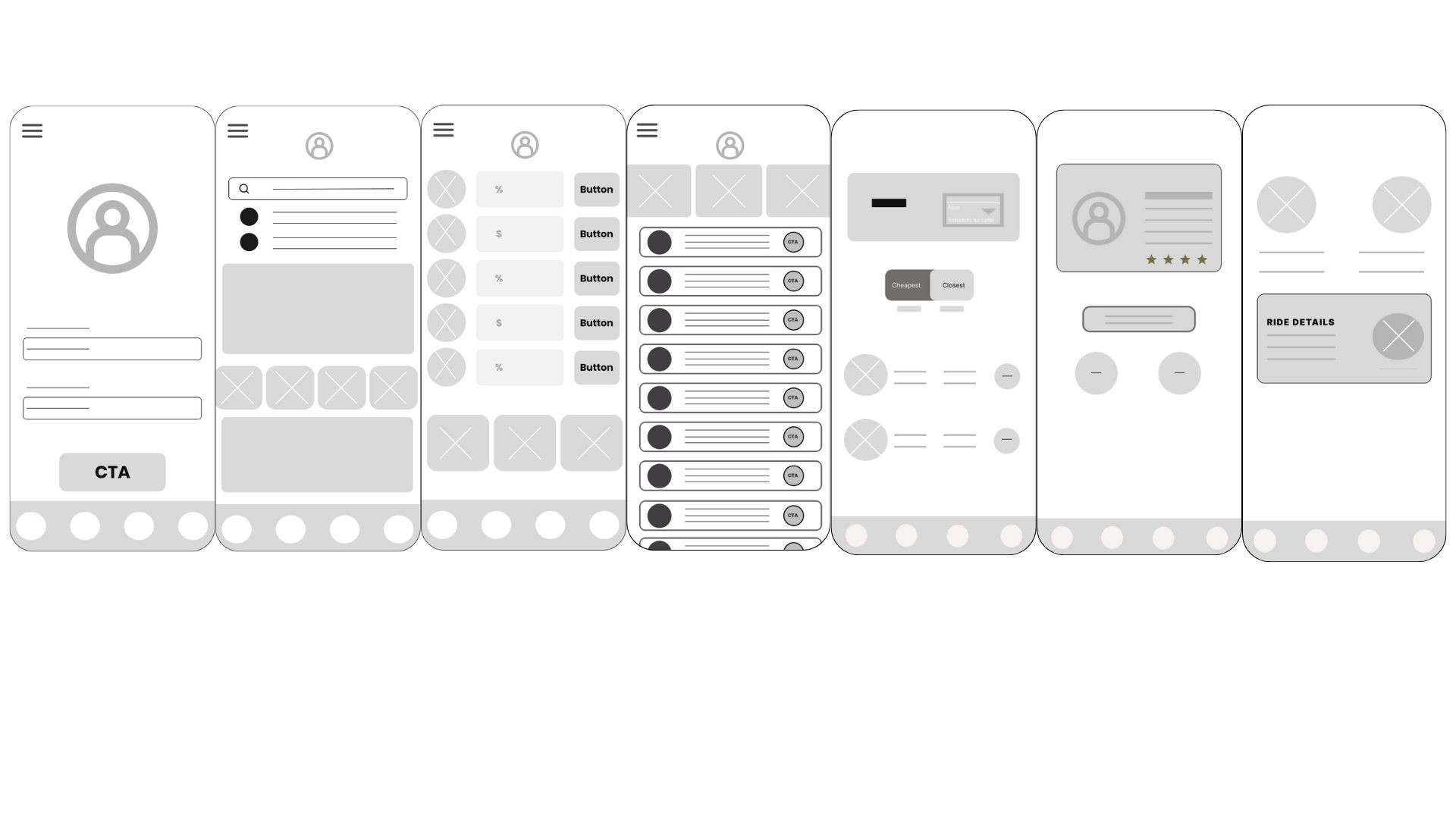
Low Fidelity
Final iteration process
Final iteration process
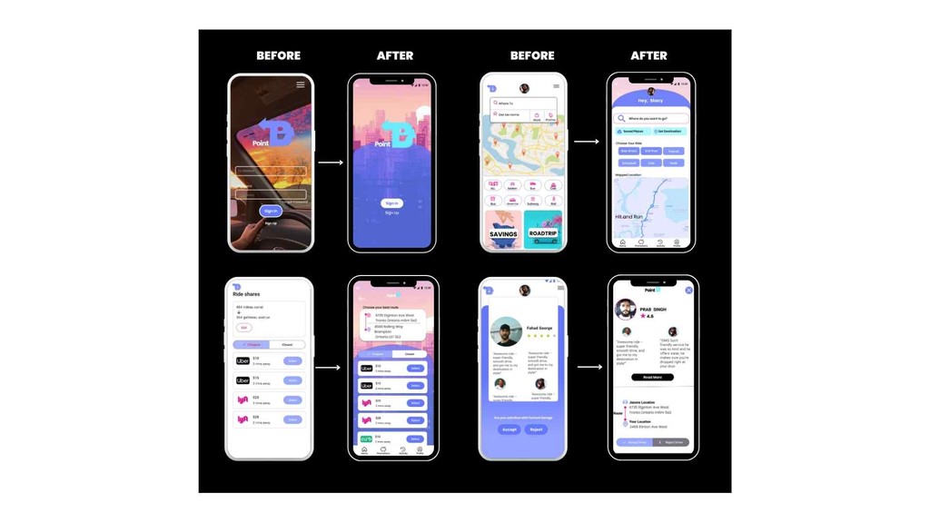
Before: Initial High-Fidelity Iterations
The design heavily focused on price promotion.
The interface was cluttered with too many elements, making navigation difficult.
The use of colors was overwhelming and lacked cohesion.
User safety features and multiple transportation options were not prominently featured.
After: Final Iterations
I decluttered the screen by removing unnecessary elements and streamlining the layout.
Simplified the use of colours to create a more cohesive and visually appealing interface.
Enhanced navigation to make it easier for users to find and connect with multiple transportation routes.
Incorporated clear and accessible user safety features.
Ensured that price promotion remained easily accessible but not the sole focus.
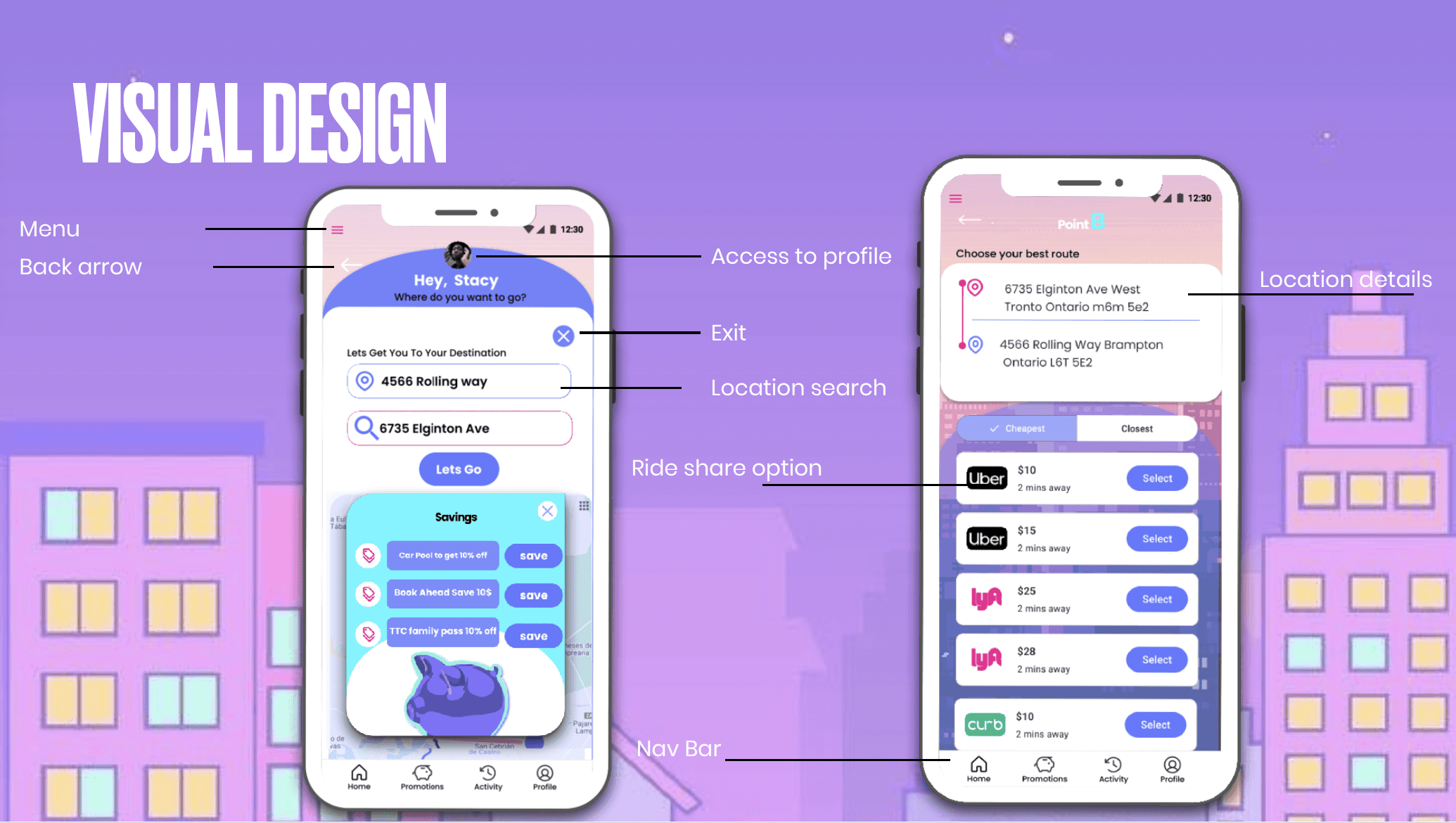
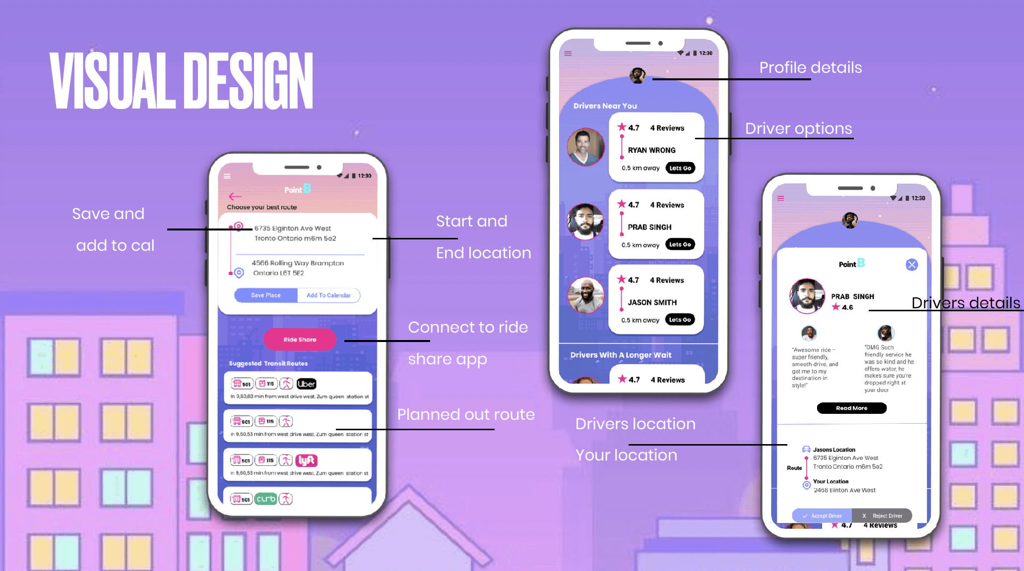
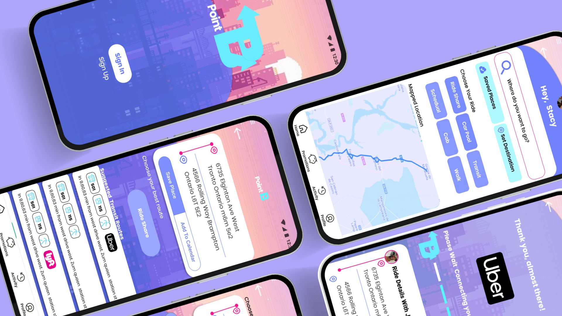
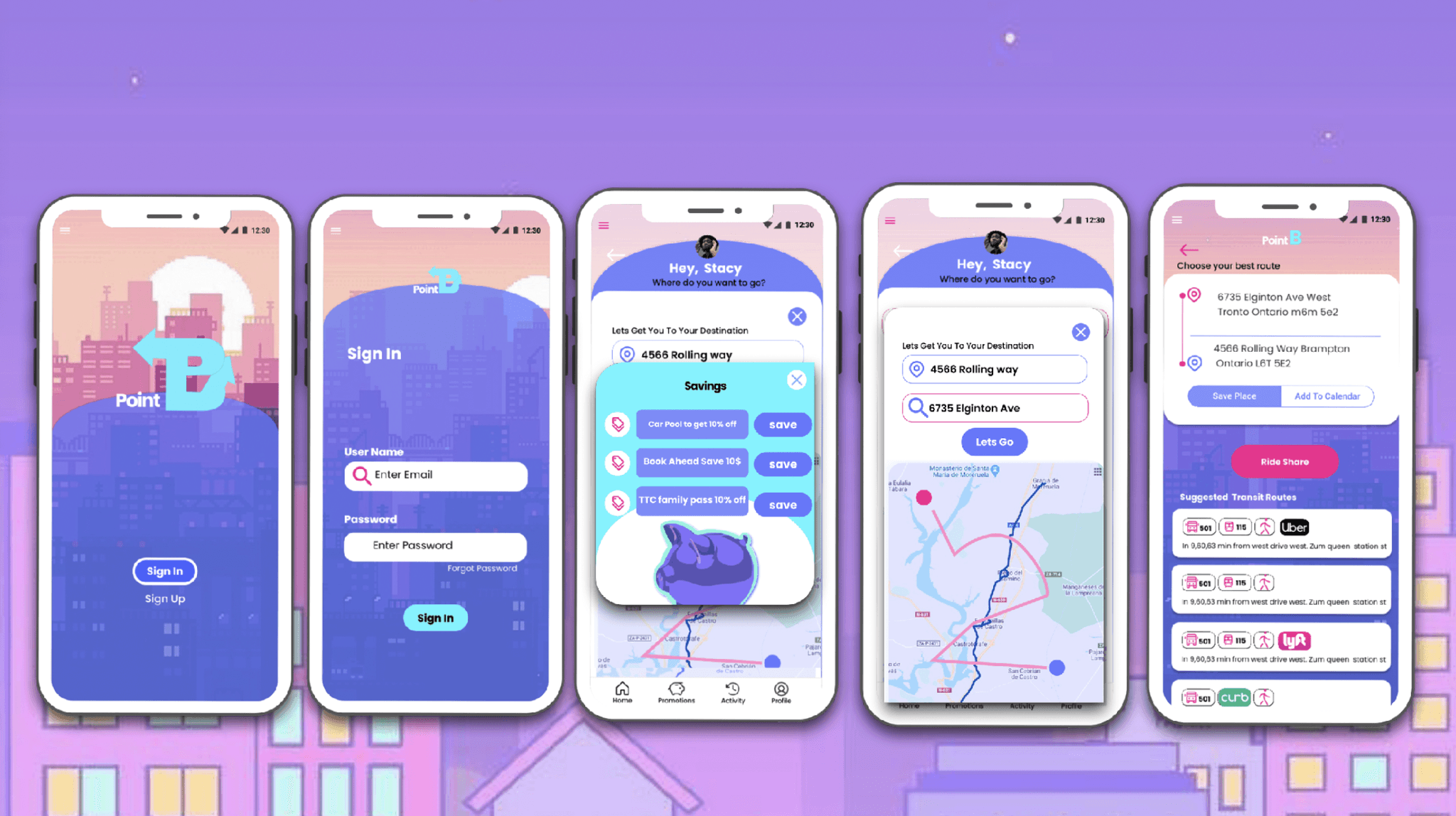
Final Design
Final Design
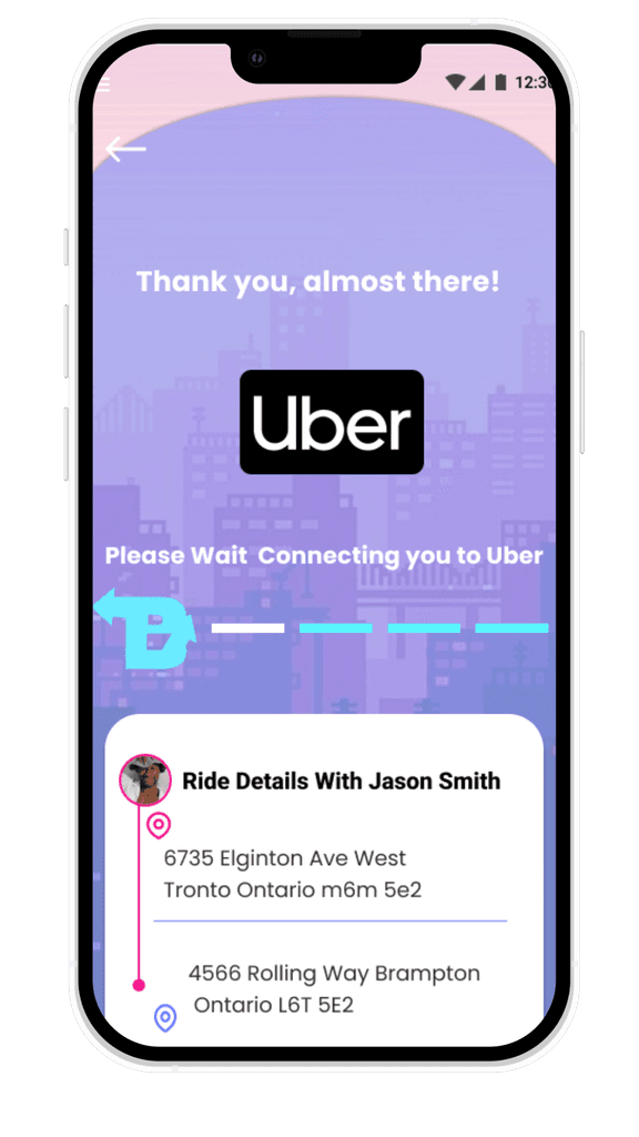
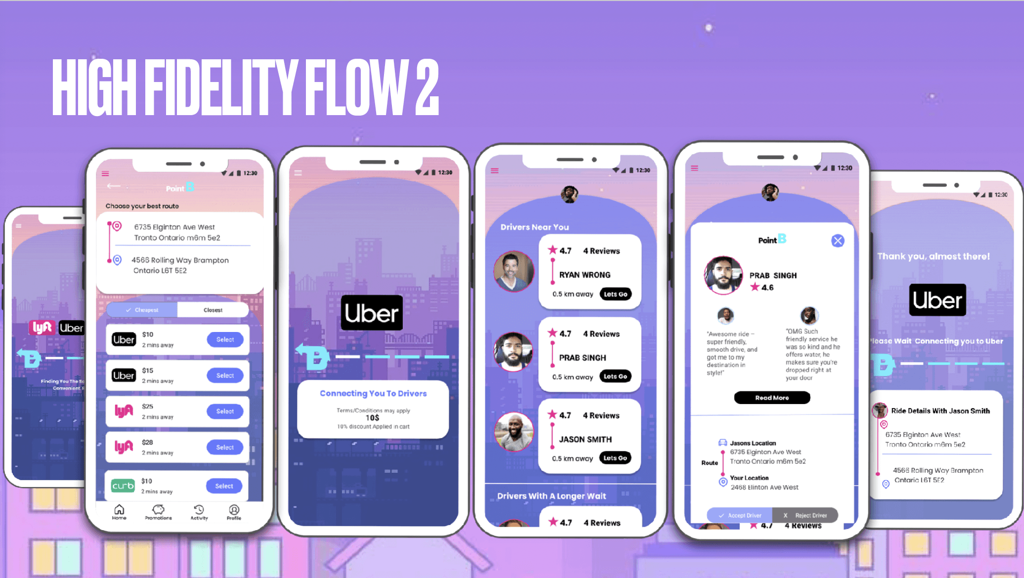
Promotion Pop-Up Loading Screens: I added informative loading screens that provide users with updates, keeping them aware of their progress and the stages of the process they're on.
Safety Features: To ensure user safety, I included scheduling and driver reviews. Users can now choose drivers based on distance and location, adding an extra layer of security and convenience.
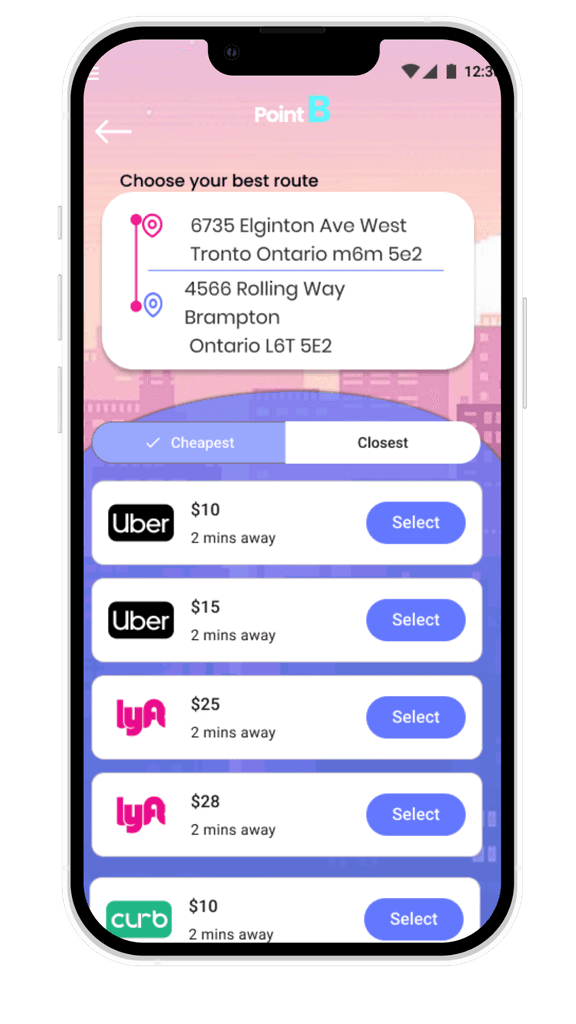
Multiple Transportation Options: Despite adding various transportation options, I made sure that ride-share options remained easily accessible. Users can quickly find and select ride-share services.
Cost Transparency: The cost of each ride is always clearly displayed, and users are provided with different options to choose from based on their preferences and budget.
Promotion Pop-Up Loading Screens: I added informative loading screens that provide users with updates, keeping them aware of their progress and the stages of the process they're on.
Safety Features: To ensure user safety, I included scheduling and driver reviews. Users can now choose drivers based on distance and location, adding an extra layer of security and convenience.
Multiple Transportation Options: Despite adding various transportation options, I made sure that ride-share options remained easily accessible. Users can quickly find and select ride-share services.
Cost Transparency: The cost of each ride is always clearly displayed, and users are provided with different options to choose from based on their preferences and budget.
Thank You!
Thank You!
Thank You!