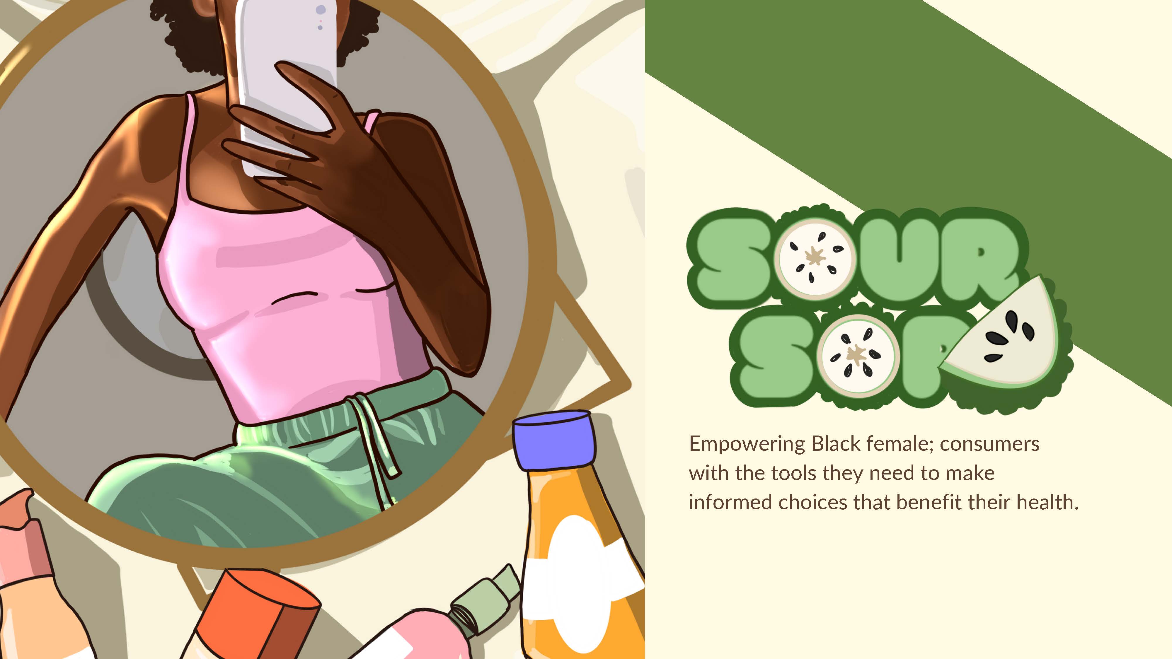
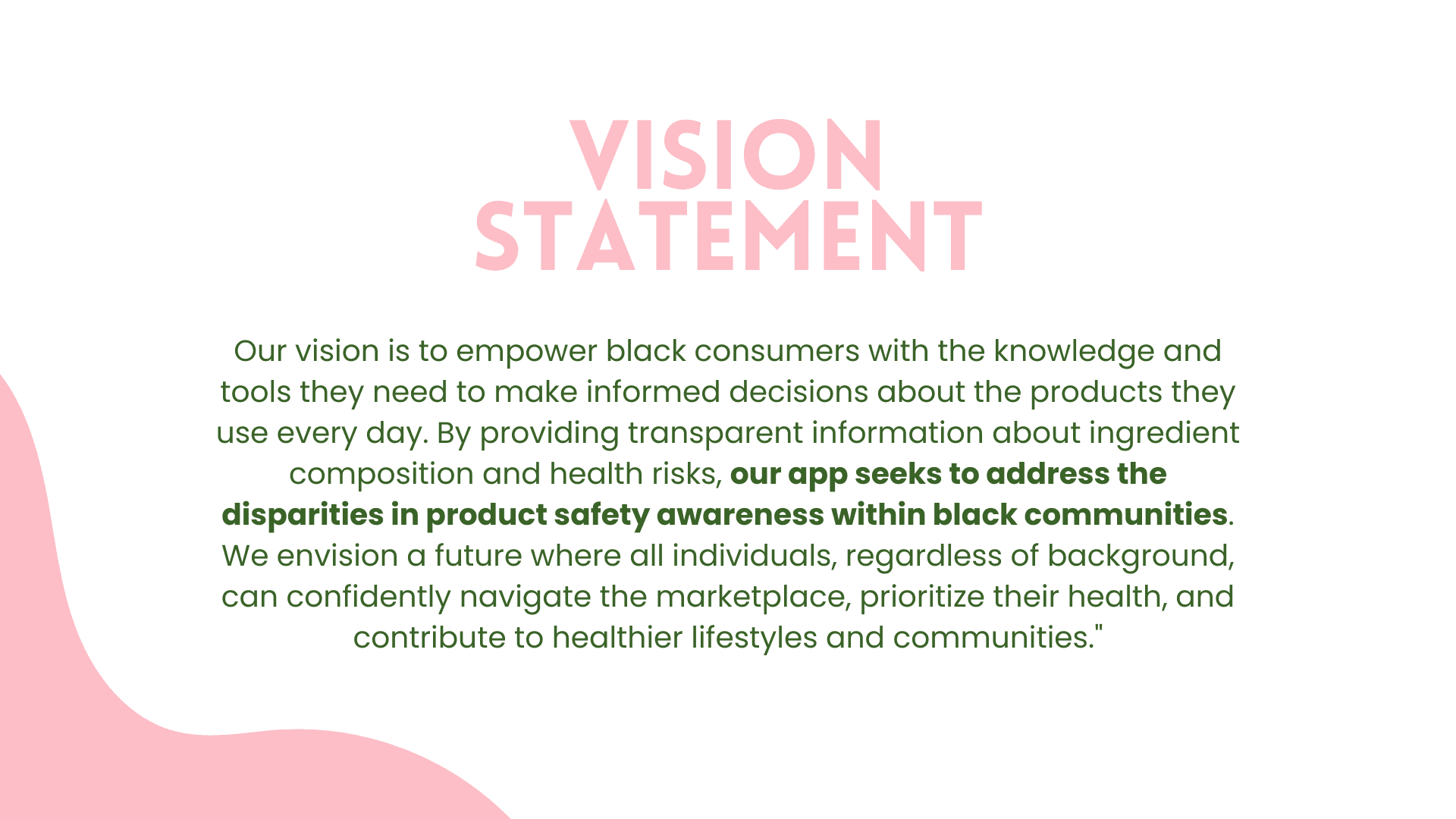
Soursop is currently undergoing MVP development for a startup. While I can't delve deeply into the product specifics, I can outline my design process for it
Soursop is currently undergoing MVP development for a startup. While I can't delve deeply into the product specifics, I can outline my design process for it
Soursop is currently undergoing MVP development for a startup. While I can't delve deeply into the product specifics, I can outline my design process for it
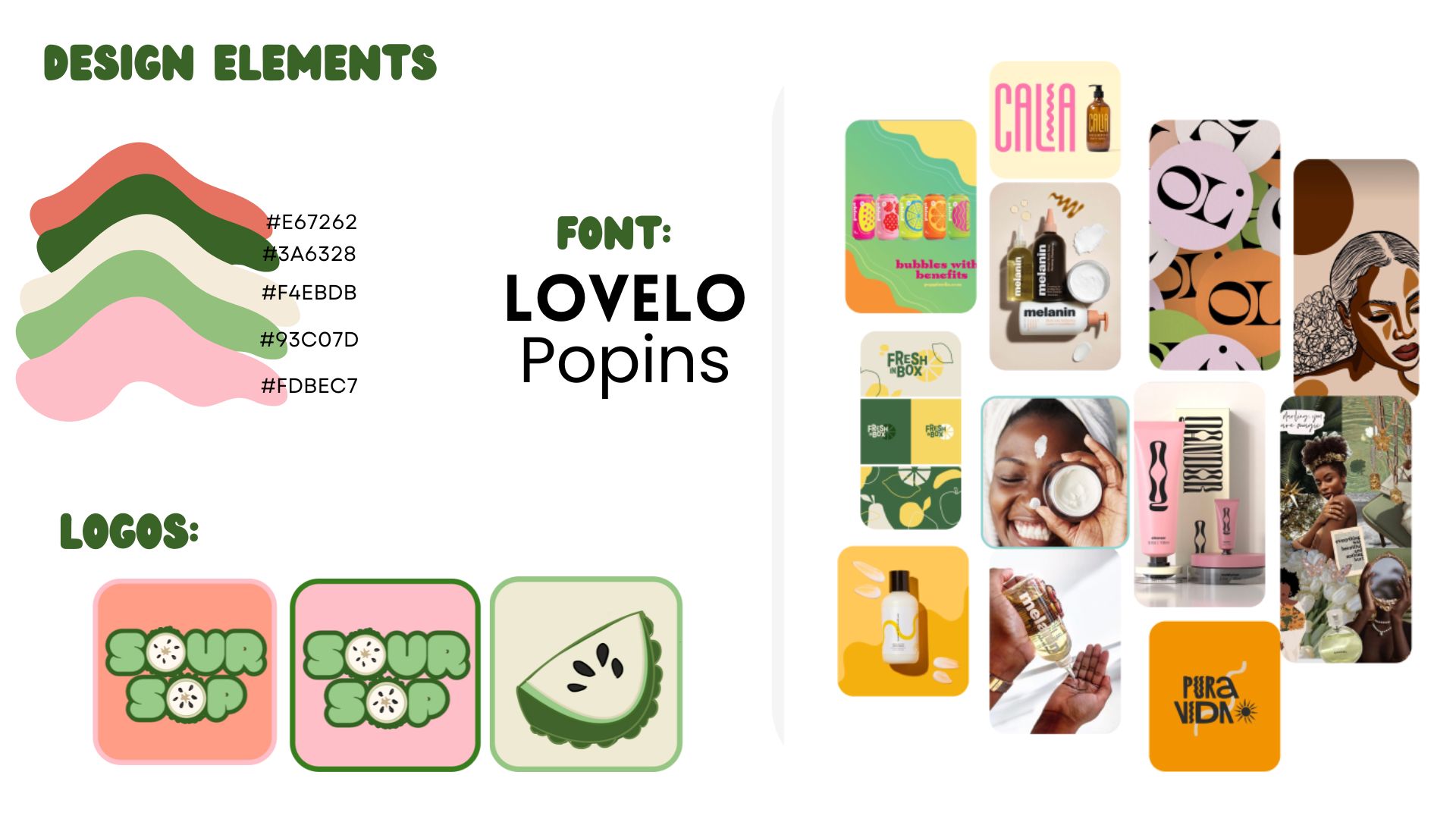
Objective: I aimed for the font and color selection to be fresh, bright, and clean.
Mood Board: I created a mood board to gather inspiration and guide my design process.
Color Story: After finalizing the color story, I chose a palette that aligned with our brand values.
Logo Design: I designed the logo to be simple yet distinctive, ensuring it stands out in the App Store.
Font Choice: I selected a youthful font to keep the branding on point and appealing to our target audience.
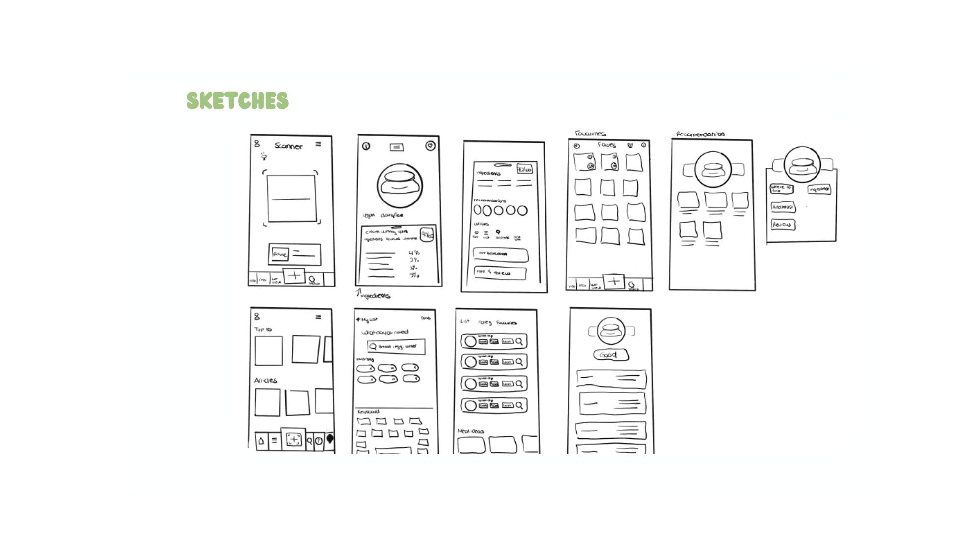
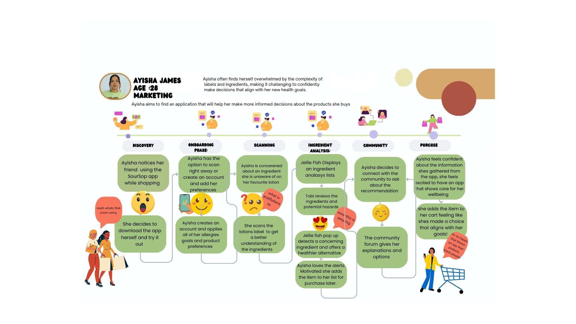
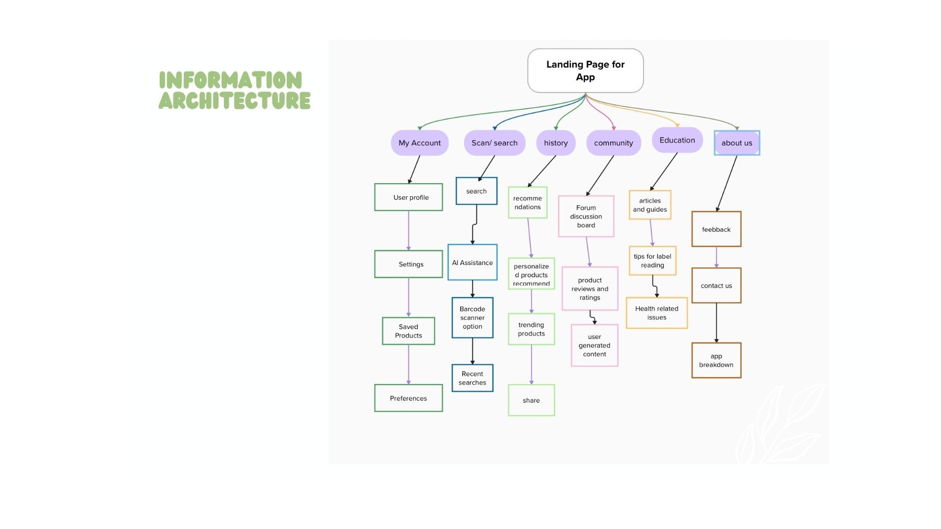
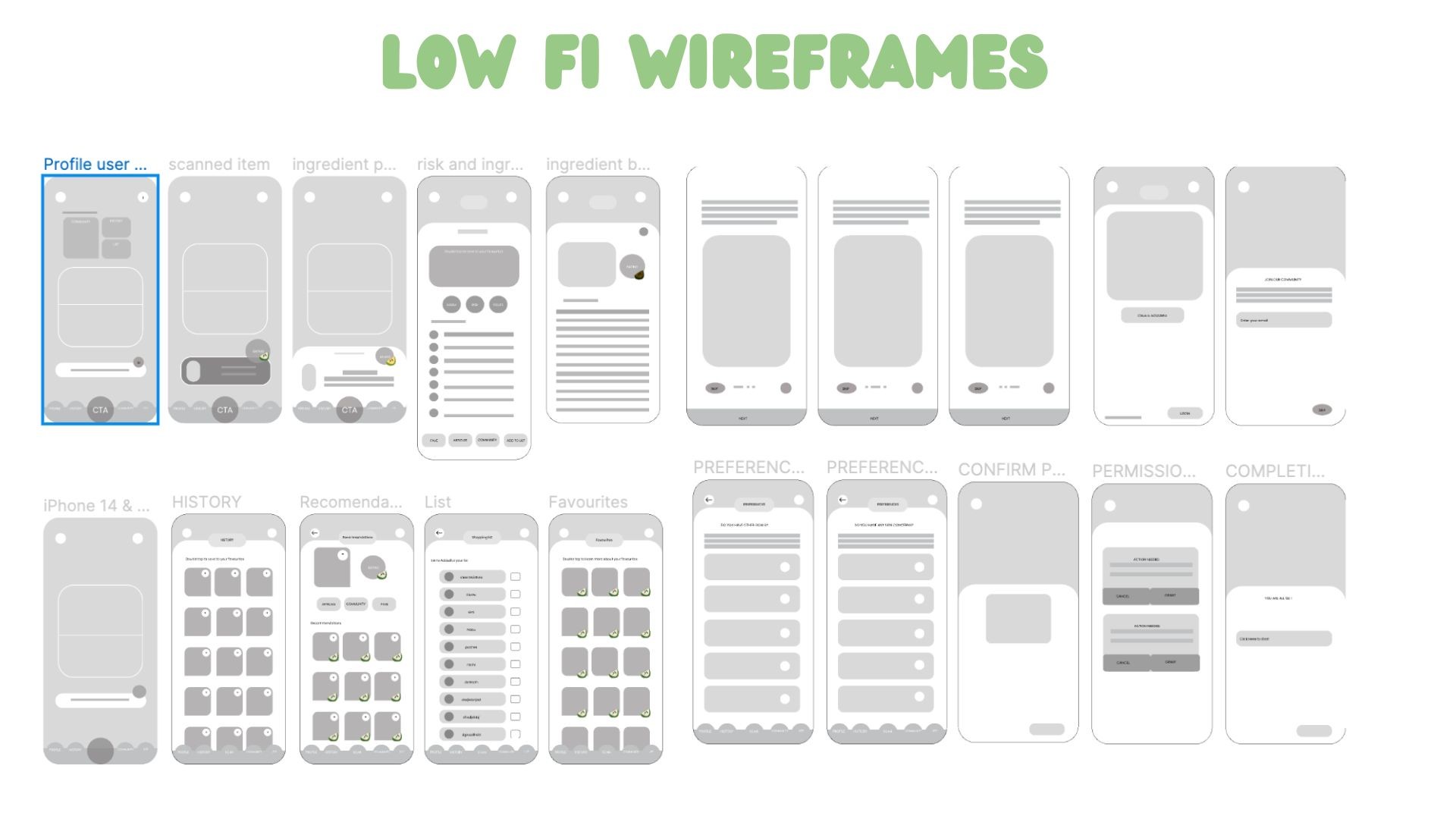
After defining the user personas and establishing the information architecture (IA), I began the design process with a series of sketches. These initial sketches allowed me to map out the visual flow and overall structure of the product, ensuring that the layout would be intuitive and aligned with the needs and expectations of our users. By visualizing the interface in this early stage, I was able to iterate quickly and refine the design, creating a solid foundation for the subsequent stages of development.
After defining the user personas and establishing the information architecture (IA), I began the design process with a series of sketches. These initial sketches allowed me to map out the visual flow and overall structure of the product, ensuring that the layout would be intuitive and aligned with the needs and expectations of our users. By visualizing the interface in this early stage, I was able to iterate quickly and refine the design, creating a solid foundation for the subsequent stages of development.
After defining the user personas and establishing the information architecture (IA), I began the design process with a series of sketches. These initial sketches allowed me to map out the visual flow and overall structure of the product, ensuring that the layout would be intuitive and aligned with the needs and expectations of our users. By visualizing the interface in this early stage, I was able to iterate quickly and refine the design, creating a solid foundation for the subsequent stages of development.
PRODUCT DEMO
PRODUCT DEMO
PRODUCT DEMO
The user interface (UI) for Sour Sop needed to be bold, friendly, and relatable for users. The color palette was carefully chosen to engage and appeal to our target audience. In designing the UI, I focused on incorporating unique branding elements that not only distinguish Sour Sop but also create a cohesive experience across all screens.
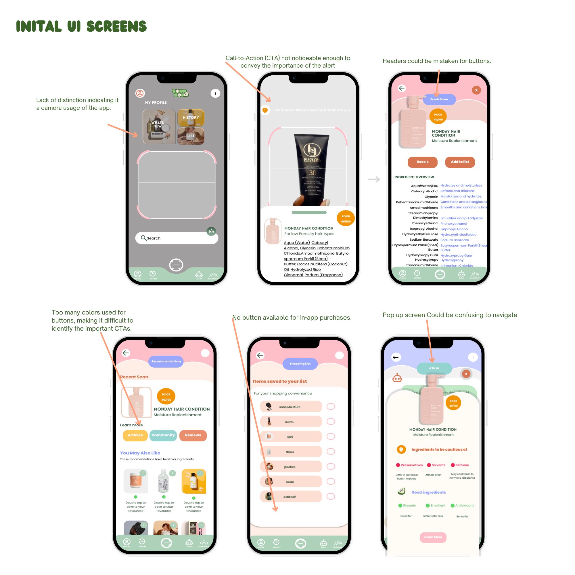
The user interface (UI) for Sour Sop needed to be bold, friendly, and relatable for users. The color palette was carefully chosen to engage and appeal to our target audience. In designing the UI, I focused on incorporating unique branding elements that not only distinguish Sour Sop but also create a cohesive experience across all screens.
The user interface (UI) for Sour Sop needed to be bold, friendly, and relatable for users. The color palette was carefully chosen to engage and appeal to our target audience. In designing the UI, I focused on incorporating unique branding elements that not only distinguish Sour Sop but also create a cohesive experience across all screens.
The user interface (UI) for Sour Sop needed to be bold, friendly, and relatable for users. The color palette was carefully chosen to engage and appeal to our target audience. In designing the UI, I focused on incorporating unique branding elements that not only distinguish Sour Sop but also create a cohesive experience across all screens.
After defining the user personas and establishing the information architecture (IA), I began the design process with a series of sketches. These initial sketches allowed me to map out the visual flow and overall structure of the product, ensuring that the layout would be intuitive and aligned with the needs and expectations of our users. By visualizing the interface in this early stage, I was able to iterate quickly and refine the design, creating a solid foundation for the subsequent stages of development.
After defining the user personas and establishing the information architecture (IA), I began the design process with a series of sketches. These initial sketches allowed me to map out the visual flow and overall structure of the product, ensuring that the layout would be intuitive and aligned with the needs and expectations of our users. By visualizing the interface in this early stage, I was able to iterate quickly and refine the design, creating a solid foundation for the subsequent stages of development.
Soursop is currently undergoing MVP development for a startup. While I can't delve deeply into the product specifics, I can outline my design process for it
Soursop is currently undergoing MVP development for a startup. While I can't delve deeply into the product specifics, I can outline my design process for it
SourSop Mobile App UI
SourSop Mobile App UI
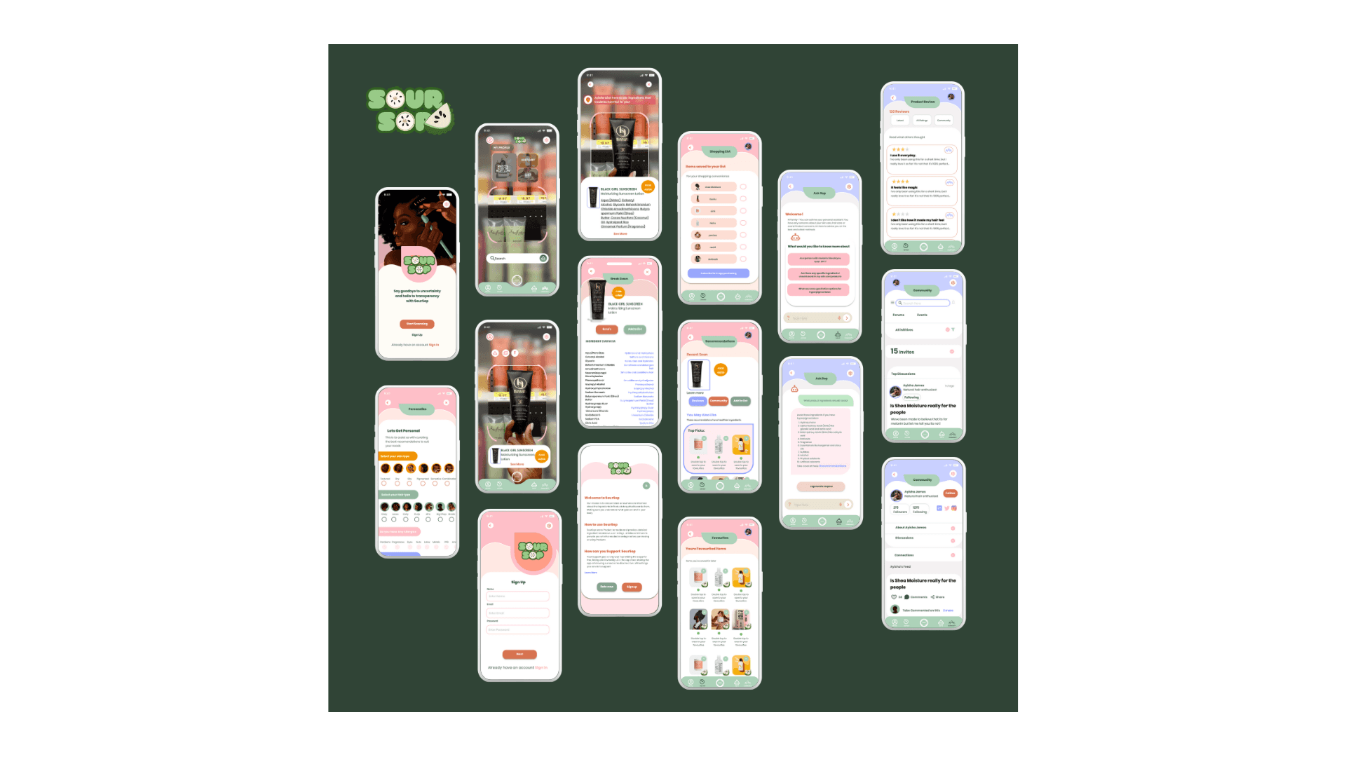
FINAL UI DESIGN
FINAL UI DESIGN
FINAL UI DESIGN